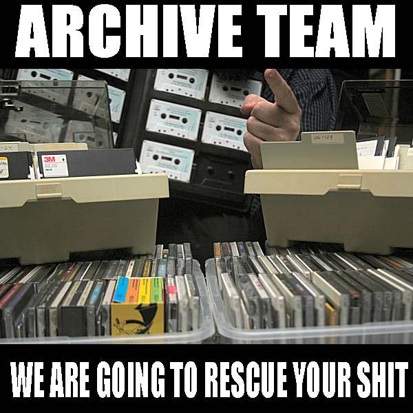 Formed in 2009, the Archive Team (not to be confused with the archive.org Archive-It Team) is a rogue archivist collective dedicated to saving copies of rapidly dying or deleted websites for the sake of history and digital heritage. The group is 100% composed of volunteers and interested parties, and has expanded into a large amount of related projects for saving online and digital history.

REACT COOL PORTAL
This is a React hook for Portals. It helps you render children into a DOM node that exists outside the DOM hierarchy of the parent component. From now on you will never need to struggle with modals, dropdowns, tooltips etc. Check the features section out to learn more. Hope you guys 👍🏻 it.


Live Demo

Features
🍒 Renders an element or component to<body>or a specified DOM element.🎣 React Portals feat. Hook.🤖 Built-in state controllers, event listeners and many useful features for a comprehensive DX.🧱 Used as a scaffold to build your customized hook.🧹 Auto remove un-used portal container for you. Doesn't produce any DOM mess.📜 Supports TypeScript type definition.🗄️ Server-side rendering compatibility.🦠 Tiny size (~ 1.4KB gzipped). No external dependencies, aside for thereactandreact-dom.
Requirement
To use react-cool-portal, you must use react@16.8.0 or greater which includes hooks.
Installation
This package is distributed via npm.
$ yarn add react-cool-portal
# or
$ npm install --save react-cool-portal
Usage
Here are some minimal examples of how does it work. You can learn more about it by checking the API out.
Basic Use Case
Inserts an element or component into the a different location in the DOM.
import React from "react";
import usePortal from "react-cool-portal";

const App = () => {
  const { Portal } = usePortal();

  return (
    <div>
      <Portal>
        <p>
          Wow! I am rendered outside the DOM hierarchy of my parent component.
        </p>
      </Portal>
    </div>
  );
};
By default, the children of portal is rendered into <div id="react-cool-portal"> of <body>. You can specify the DOM element you want through the containerId option.
import React from "react";
import usePortal from "react-cool-portal";

const App = () => {
  const { Portal } = usePortal({ containerId: "my-portal-root" });

  return (
    <div>
      <Portal>
        <p>Now I am rendered into the specify element (id="my-portal-root").</p>
      </Portal>
    </div>
  );
};
Note: If the container element doesn't exist, we will create it for you.
Use with State
react-cool-portal provides many useful features, which enable you to build a component with state. For instance, modal, dropdown, tooltip and so on.

import React from "react";
import usePortal from "react-cool-portal";

const App = () => {
  const { Portal, isShow, show, hide, toggle } = usePortal({
    defaultShow: false, // The default visibility of portal, default is true
    onShow: (e) => {
      // Triggered when portal is shown
      // The event object will be the parameter of "show(e?)"
    },
    onHide: (e) => {
      // Triggered when portal is hidden
      // The event object will be the parameter of "hide(e?)", it maybe MouseEvent (on clicks outside) or KeyboardEvent (press ESC key)
    },
  });

  return (
    <div>
      <button onClick={show}>Open Modal</button>
      <button onClick={hide}>Close Modal</button>
      <button onClick={toggle}>{isShow ? "Close" : "Open"} Modal</button>
      <Portal>
        <div className="modal" tabIndex={-1}>
          <div
            className="modal-dialog"
            role="dialog"
            aria-labelledby="modal-label"
            aria-modal="true"
          >
            <div className="modal-header">
              <h5 id="modal-label" className="modal-title">
                Modal title
              </h5>
            </div>
            <div className="modal-body">
              <p>Modal body text goes here.</p>
            </div>
          </div>
        </div>
      </Portal>
    </div>
  );
};
🧹 When no element in the container, we will remove it for you to avoid DOM mess.
The above example shows how easy you can handle the visibility of your component. You may ask how to handle the visibility with animations? No worries, you can disable the built-in show/hide functions by setting the internalShowHide option to false then handling the visibility of your component via the isShow state.
import React from "react";
import usePortal from "react-cool-portal";

const App = () => {
  const { Portal, isShow, show, hide, toggle } = usePortal({
    defaultShow: false,
    internalShowHide: false, // Disable the built-in show/hide portal functions, default is true
    onShow: (e) => {
      // Triggered when "isShow" is set to true
    },
    onHide: (e) => {
      // Triggered when "isShow" is set to false
    },
  });

  return (
    <div>
      <button onClick={show}>Open Modal</button>
      <button onClick={hide}>Close Modal</button>
      <button onClick={toggle}>{isShow ? "Close" : "Open"} Modal</button>
      <Portal>
        <div
          // Now you can use the "isShow" state to handle the CSS animations
          className={`modal${isShow ? " modal-open" : ""}`}
          tabIndex={-1}
        >
          <div
            className="modal-dialog"
            role="dialog"
            aria-labelledby="modal-label"
            aria-modal="true"
          >
            <div className="modal-header">
              <h5 id="modal-label" className="modal-title">
                Modal title
              </h5>
            </div>
            <div className="modal-body">
              <p>Modal body text goes here.</p>
            </div>
          </div>
        </div>
      </Portal>
    </div>
  );
};
Besides that, you can also handle the visibility of your component via React animation events or transition events like what I did for the demo app.
Build Your Customized Hook
Are you tired to write the same code over and over again? It's time to build your own hook based on react-cool-portal then use it wherever you want.
import React, { useCallback } from "react";
import usePortal from "react-cool-portal";

// Customize your hook based on react-cool-portal
const useModal = (options = {}) => {
  const { Portal, isShow, ...rest } = usePortal({
    ...options,
    defaultShow: false,
    internalShowHide: false,
  });

  const Modal = useCallback(
    ({ children }) => (
      <Portal>
        <div className={`modal${isShow ? " modal-open" : ""}`} tabIndex={-1}>
          {children}
        </div>
      </Portal>
    ),
    [isShow]
  );

  return { Modal, isShow, ...rest };
};

// Use it wherever you want
const App = () => {
  const { Modal, show, hide } = useModal();

  return (
    <div>
      <button onClick={show}>Open Modal</button>
      <button onClick={hide}>Close Modal</button>
      <Modal>
        <div
          className="modal-dialog"
          role="dialog"
          aria-labelledby="modal-label"
          aria-modal="true"
        >
          <div className="modal-header">
            <h5 id="modal-label" className="modal-title">
              Modal title
            </h5>
          </div>
          <div className="modal-body">
            <p>Modal body text goes here.</p>
          </div>
        </div>
      </Modal>
    </div>
  );
};
One problem of the above example is that CSS transition/animation will be cut off due to the re-creating of the Portal component. So if you want to apply transitions or animations to the wrapped element of the customized hook. The isShow need to be passed from the props.
const useModal = (options = {}) => {
  const { Portal, ...rest } = usePortal({
    ...options,
    defaultShow: false,
    internalShowHide: false,
  });

  const Modal = useCallback(
    // Pass the "isShow" from props to prevent CSS transition/animation to be cut off
    ({ isShow, children }) => (
      <Portal>
        <div className={`modal${isShow ? " modal-open" : ""}`} tabIndex={-1}>
          {children}
        </div>
      </Portal>
    ),
    []
  );

  return { Modal, ...rest };
};
API
const returnObj = usePortal(parameterObj);Return object
It's returned with the following properties.
| Key | Type | Default | Description |
|---|---|---|---|
| Portal | component | Renders children into a DOM node that exists outside the DOM hierarchy of the parent component. | |
| isShow | boolean | false |
The show/hide state of portal. |
| show | function | To show the portal or set the isShow to true. |
|
| hide | function | To hide the portal or set the isShow to false. |
|
| toggle | function | To toggle (show/hide) the portal or set the isShow to true/false. |
Parameter object (optional)
When use react-cool-portal you can configure the following options via the parameter.
| Key | Type | Default | Description |
|---|---|---|---|
| containerId | string | react-cool-portal |
You can specify your own container id from an existing DOM element or let this hook automatically creates it for you. |
| defaultShow | boolean | true |
The initial show/hide state of the portal. |
| clickOutsideToHide | boolean | true |
Hide the portal by clicking outside of it. |
| escToHide | boolean | true |
Hide the portal by pressing ESC key. |
| internalShowHide | boolean | true |
Enable/disable the built-in show/hide portal functions, which gives you a flexible way to handle your portal. |
| onShow | function | Triggered when portal is shown or the isShow set to true. |
|
| onHide | function | Triggered when portal is hidden or the isShow set to false. |
Contributors ✨
Thanks goes to these wonderful people (emoji key):
 Welly |
 Dawid Karabin |
This project follows the all-contributors specification. Contributions of any kind welcome!