レスポンシブWebデザインのサイトを作るときのMedia Queriesの順番を考えてみた
2013年01月27日
 ちょうど今レスポンシブWebデザインのサイトを制作しているのですが、Media Queriesで画面サイズ別にCSSを記述していくときにどのような順番で記述すればよいのか、改めて調べてみたらいろいろ迷ってしまいました。
今までいろいろなやり方を試してきたのですが、一度整理してみたいと思います。
ちょうど今レスポンシブWebデザインのサイトを制作しているのですが、Media Queriesで画面サイズ別にCSSを記述していくときにどのような順番で記述すればよいのか、改めて調べてみたらいろいろ迷ってしまいました。
今までいろいろなやり方を試してきたのですが、一度整理してみたいと思います。
記述方法の種類
一般的なMedia Queriesの記述の方法としては、以下のようなやり方があります。︵ブレイクポイントを480px、768px、980pxとした場合の例です︶1. PCのスタイルから記述していく方法
デフォルトでPC用のスタイルを定義し、タブレット/スマートフォン用のスタイルはMedia Queriesを使って上書きしていくPCファースト的な方法です。
/* デフォルト:980px以上用(PC用)の記述 */
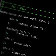
@media screen and (max-width: 979px) {
/* 979px以下用(タブレット用)の記述 */
}
@media screen and (max-width: 767px) {
/* 767px以下用(タブレット/スマートフォン用)の記述 */
}
@media screen and (max-width: 479px) {
/* 479px以下用(スマートフォン用)の記述 */
}
2. スマートフォン用のスタイルから記述していく方法
デフォルトでスマートフォン用のスタイルを定義し、タブレット/PC用のスタイルをMedia Queriesを使って上書きしていくモバイルファースト的な方法です。
 /* デフォルト:479px以下用(スマートフォン用)の記述 */
@media screen and (min-width: 480px) {
 /* 480px以上用(タブレット/スマートフォン用)の記述 */
}
@media screen and (min-width: 768px) {
 /* 768px以上用(タブレット用)の記述 */
}
@media screen and (min-width: 980px) {
 /* 980px以上用(PC用)の記述 */
}
3. それぞれの画面幅個別に指定する方法
それぞれの画面幅毎に全く別のスタイルを定義する方法です。
@media screen and (min-width: 980px) {
 /* 980px以上用(PC用)の記述 */
@media screen and (min-width: 768px) and (max-width: 979px) {
 /* 768px - 979px用(タブレット用)の記述 */
}
@media screen and (min-width: 480px) and (max-width: 767px)  {
 /* 480px - 767px用(タブレット/スマートフォン用)の記述 */
}
@media screen and (max-width: 479px) {
 /* 479px以下用(スマートフォン用)の記述 */
}
実際には、部分的に3を用いつつも、1か2のどちらかを選択することになるかと思います。
実際どれがいいの?
モバイルファースト的な観点では、スマートフォンのスタイルから定義する2の方式が良いかと思います。ただ、IE8以下の対応を考えた場合、つまずいてしまいます。 IE8以下では、Media Queriesは使えませんでの、以下のいずれかの対応をする必要があります。 ●Respond.jsやcss3-mediaqueries-jsを使って、IE8以下もレスポンシブ対応を行う ●IE8以下はPCでの表示はサポートするが、レスポンシブ対応はしない ●IE8以下は完全除外! 完全除外は現状のIE8のブラウザシェアから考えて、制作の現場では取りにくい選択肢です。Respond.jsやcss3-mediaqueries-jsを使う手法はよくとられていますが、そもそも古いIEでのスマートフォンサイズの表示は、ごく一部のWindows Phoneを除いて想定しにくく、サポートすべきかについては疑問が残ります。 現状のブラウザシャアや制作の効率性を考えると、IE8以下でのレスポンシブ対応はしないというのが現実的ではないかと考えています。 ただ、IE8以下では、Respond.jsやcss3-mediaqueries.jsを使わないと、Media Queriesは解釈されず、デフォルトの記述のみが適用されます。つまり、モバイルファースト的な記述をすると、IE8以下ではモバイル用の表示がされてしまうのです。<link href="common.css"type="text/css" media="all" /> <link href="modern.css"type="text/css" media="all and (min-width: 100px)" /> <!--[if lt IE 9]> <link href="ie8.css"type="text/css" media="all" /> <![endif]-->まず、基本的なスタイルを定義したcommon.cssを読み込ませます。 次にレスポンシブ対応のCSSを記述したmodern.cssをMedia Queriesを使って読み込ませます。Media QueriesはIE8以下では解釈されないため、IE8以下には読み込まれません。 一方、ie8.cssにIE8以下用のスタイルを定義し、分岐させてIE8以下のみに読み込ませます。 これであれば、モバイルファースト的な記述でも古いIEに対応させることができますが、PC用の表示をmodern.cssにもie.cssにも記述しなければならず、制作面・運用面で効率的とは言えません。


