かつてはJavaScriptを利用していたものの、今ではCSSのみで実装できる10の小技
2011年に﹁少しのコードで実装可能な20のjQuery小技集﹂という記事で数々の便利な制作技を紹介したのですが、時は流れ、今ではCSSのみで表現できるものが多くなってきました。という事で今回はその記事内で紹介した技を中心に、かつてはJavaScriptを利用していたものの、今ではCSSのみで実装できる小技を紹介します。
 ↑私が10年以上利用している会計ソフト!
今まではJavaScriptに頼っていたような表現方法も、だいぶCSSのみで実装できるようになりましたね。ブラウザー間の表示問題はまだまだあるかと思いますが、サイトによっては採用できる小技も多いのではないでしょうか?その他おすすめCSS小技があれば、ぜひ教えてくださいね!
目次へ。
↑私が10年以上利用している会計ソフト!
今まではJavaScriptに頼っていたような表現方法も、だいぶCSSのみで実装できるようになりましたね。ブラウザー間の表示問題はまだまだあるかと思いますが、サイトによっては採用できる小技も多いのではないでしょうか?その他おすすめCSS小技があれば、ぜひ教えてくださいね!
目次へ。
目次
(一)Div全体をクリックできるようにする (二)テーブルの偶数・奇数の行の色を変える (三)フォームにテキストを入れておき、フォーカスで消す︵文字色も変更︶ (四)ラジオボタンとチェックボックスを装飾する (五)スライドパネル (六)アコーディオン (七)ツールチップ (八)言語によってスタイルを変更 (九)横並びのdivの高さ揃える (十)ボックスを上下左右中央に配置する それでは実際にどんな事ができるのか見てみましょう!サンプルも作ったのでコードと合わせて見てみてください!コードはサンプル内の﹁HTML﹂﹁CSS﹂といった各タブをクリックでも表示されます :)1. Div全体をクリックできるようにする
HTML5からはブロック要素・インライン要素の分類はなくなったので、a要素で div や pなど、複数の要素を囲むことができます。クリック範囲が広く作れるので、スマートフォン用Webサイトには特におすすめ。注意点として、その div がクリックできるということをわかりやすくデザインすることが大切です。
HTML
<a href="#">
<div>
<h1>The Latest News</h1>
<p>In dignissim a lacus ac sodales...</p>
<p class="more">Learn More »</p>
</div>
</a>
See the Pen Clickable div by Mana (@manabox) on CodePen.
目次へ。
2. テーブルの偶数・奇数の行の色を変える
かつてはjQueryを使っていた偶数・奇数要素の指定も、今ではCSSだけで可能。実装には:nth-child() を使い、隣接する要素の上から数えてn番目の行を装飾できます。例では奇数行にうっすらと背景に色をつけて読みやすくしています。その他以下のような書き方もできます。
●:nth-child(even) … 偶数行に
●:nth-child(2n+1) … 奇数行に
●:nth-child(odd) … 奇数行に
●:nth-child(3n) … 3の倍数行に
また、下から数えてn番目の要素には :nth-last-child() を使って指定できます。
HTML
<table>
  <tr>
    <td>こんな感じで</td>
    <td>奇数の行に</td>
  </tr>
  <tr>
    <td>色が</td>
    <td>つきます。</td>
  </tr>
</table>
CSS
tr:nth-child(odd) {
  background: #ddd;
}
See the Pen Table change colour odd rows by Mana (@manabox) on CodePen.
目次へ。
3. フォームにテキストを入れておき、フォーカスで消す︵文字色も変更︶
HTML5で導入されたplaceholder属性によって、フォームのテキスト入力欄にあらかじめテキストを入れておけるようになりました。入力中の色を変更する場合は color で直接指定します。ただし、FirefoxとIEでは、指定した色がプレースホルダーテキストにも影響してしまうので、Firefox用に ::-moz-placeholder、IE用に input:-ms-input-placeholder でプレースホルダーテキストの色を指定する必要があります。
HTML
<input type="text" placeholder="キーワードを入力">CSS
input[type="text"] {
  color: #f39;
  font-size: 16px;
  padding: 5px;
  width: 200px;
}

/* Firefox */
::-moz-placeholder {
  color: #666;
}

/* IE */
input:-ms-input-placeholder {
  color: #666;
}
See the Pen HTML5 Placeholder text field by Mana (@manabox) on CodePen.
目次へ。
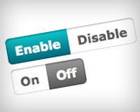
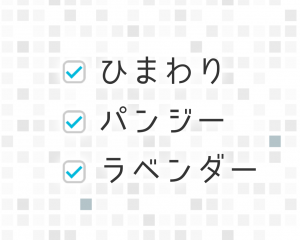
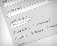
4. ラジオボタンとチェックボックスを装飾する
:before や :after 擬似要素を使い、チェックボックスやラジオボタン風要素を作って装飾します。チェックマークやラジオボタンの丸印等はお好みでカスタマイズしてください。
チェックボックス
HTML
<form action="#">
  <p>
    <input type="checkbox" id="test1" checked>
    <label for="test1">Apple</label>
  </p>
</form>
CSS
[type="checkbox"]:checked,
[type="checkbox"]:not(:checked) {
    position: absolute;
    left: -9999px;
}
[type="checkbox"]:checked + label,
[type="checkbox"]:not(:checked) + label
{
    position: relative;
    padding-left: 28px;
    cursor: pointer;
    line-height: 20px;
    display: inline-block;
    color: #666;
}
[type="checkbox"]:checked + label:before,
[type="checkbox"]:not(:checked) + label:before {
    content: '';
    position: absolute;
    left: 0;
    top: 0;
    width: 18px;
    height: 18px;
    border: 1px solid #ddd;
    background: #fff;
}
[type="checkbox"]:checked + label:after,
[type="checkbox"]:not(:checked) + label:after {
    content: '';
    width: 8px;
    height: 8px;
    background: #00a69c;
    position: absolute;
    top: 6px;
    left: 6px;
    -webkit-transition: all 0.2s ease;
    transition: all 0.2s ease;
}
[type="checkbox"]:not(:checked) + label:after {
    opacity: 0;
    -webkit-transform: scale(0);
    transform: scale(0);
}
[type="checkbox"]:checked + label:after {
    opacity: 1;
    -webkit-transform: scale(1);
    transform: scale(1);
}
See the Pen Custom checkbox CSS only by Mana (@manabox) on CodePen.
ラジオボタン
HTML
<form action="#">
  <p>
    <input type="radio" id="test1" name="radio-group" checked>
    <label for="test1">Apple</label>
  </p>
</form>
CSS
[type="radio"]:checked,
[type="radio"]:not(:checked) {
    position: absolute;
    left: -9999px;
}
[type="radio"]:checked + label,
[type="radio"]:not(:checked) + label
{
    position: relative;
    padding-left: 28px;
    cursor: pointer;
    line-height: 20px;
    display: inline-block;
    color: #666;
}
[type="radio"]:checked + label:before,
[type="radio"]:not(:checked) + label:before {
    content: '';
    position: absolute;
    left: 0;
    top: 0;
    width: 18px;
    height: 18px;
    border: 1px solid #ddd;
    border-radius: 100%;
    background: #fff;
}
[type="radio"]:checked + label:after,
[type="radio"]:not(:checked) + label:after {
    content: '';
    width: 12px;
    height: 12px;
    background: #F87DA9;
    position: absolute;
    top: 4px;
    left: 4px;
    border-radius: 100%;
    -webkit-transition: all 0.2s ease;
    transition: all 0.2s ease;
}
[type="radio"]:not(:checked) + label:after {
    opacity: 0;
    -webkit-transform: scale(0);
    transform: scale(0);
}
[type="radio"]:checked + label:after {
    opacity: 1;
    -webkit-transform: scale(1);
    transform: scale(1);
}
See the Pen Custom radio button CSS only by Mana (@manabox) on CodePen.
目次へ。
5. スライドパネル
ボタンを押すと指定したコンテンツがスルスルッと現れる、便利なスライドパネル。これにはチェックボックスのオンオフをパネルの開閉ボタンとして利用します。CSSアニメーションも使えばjQueryで表現していたような滑らかな動きも問題なく実装できます。 HTML<label for="check">Click me</label> <input id="check" type="checkbox"> <div class="panel"> <p>I am some hidden text. ここにテキストが入ります。</p> </div>CSS
input {
  display: none;
}
label {
  cursor: pointer;
  display: inline-block;
  padding: 10px 20px;
  border-radius: 4px;
  background: #0bd;
  color: #FFF;
  -webkit-transition: 0.1s;
  transition: 0.1s;
}
label:hover {
  background: #0090aa;
}
.panel {
  -webkit-transition: .3s ease;
  transition: .3s ease;
  height: 0;
  overflow: hidden;
  background: #F5F0CF;
  margin-top: 10px;
  padding: 0;
  border-radius: 5px;
}
input:checked + .panel {
  height: auto;
  padding: 15px;
}
See the Pen Pure css slide toggle by Mana (@manabox) on CodePen.
目次へ。
6. アコーディオン
スライドパネル同様、こちらはラジオボタンを開閉ボタンとして利用します。コンテンツを入れるだけでなく、メインメニュー・サブメニューの表示にも使えそうです。 HTML
<section class="ac-container">
  <div>
    <input id="ac-1" name="accordion-1" type="radio" checked>
    <label for="ac-1">About us</label>
    <article>
      <p>Well, the way they make shows is...</p>
    </article>
  </div>
  <div>
    <input id="ac-2" name="accordion-1" type="radio">
    <label for="ac-2">How we work</label>
    <article>
      <p>Like you, I used to think the world was...</p>
    </article>
  </div>
</section>
CSS
.ac-container {
  max-width: 400px;
  border: 1px solid #ccc;
  border-top: none;
}
.ac-container label {
  height: 30px;
  line-height: 1.8;
  font-size: 20px;
  padding: 5px 20px;
  display: block;
  cursor: pointer;
  color: #666;
  background: #eee;
  border-top: 1px solid #ccc;
}
.ac-container input {
  display: none;
}
.ac-container article {
  overflow: hidden;
  height: 0;
  transition: 0.6s;
}
.ac-container input:checked ~ article {
  height: 150px;
  border-top: 1px solid #ccc;
}
See the Pen Pure Css Accordion Menu by Mana (@manabox) on CodePen.
目次へ。
7. ツールチップ
シンプルなツールチップ。ツールチップの中身はa要素の title 属性を content: attr(title); で抽出して表示しています。もっとスマートな書き方がありそうな気もするのですが、とりあえずこれで。。
HTML
<a href="#" title="Hello from speech bubble!" class="tooltip">CSS Tooltip! Hover me!</a>CSS
.tooltip {
  display: inline;
  position: relative;
}
.tooltip:hover:after{
  display: flex;
  justify-content: center;
  background: #444;
  border-radius: 8px;
  color: #fff;
  content: attr(title);
  margin: -83px auto 0;
  font-size: 16px;
  padding: 13px;
  width: 220px;
}
.tooltip:hover:before{
  border: solid;
  border-color: #444 transparent;
  border-width: 12px 6px 0 6px;
  content: "";
  left: 45%;
  bottom: 30px;
  position: absolute;
}
See the Pen CSS tooltip by Mana (@manabox) on CodePen.
目次へ。
8. 言語によってスタイルを変更
<html lang="">によって設定されている言語︵日本語ならja、アメリカ英語ならen-US等︶によってスタイルを変更可能!例では日本語なら青で表示。多言語サイトを制作する時、日本語と英語でどうにかして別のフォントを指定したい!と調べて発見した方法です。サンプル画面右上の﹁Edit on CODEPEN﹂をクリックし、言語を en-US に変更してみてください。文字がオレンジに変わります。
CSS
:lang(ja){ color: blue; }
:lang(en-US){ color: orange; }
See the Pen Change colour by language by Mana (@manabox) on CodePen.
目次へ。
9. 横並びのdivの高さ揃える
今まではJavaScriptを駆使して横並び要素の高さを揃えていましたが、先日﹁これからのCSSレイアウトはFlexboxで決まり!﹂で紹介したように、Flexboxを使えばCSSだけで実装できます。横並びにした div を包む要素にdisplay: flex; を追加するだけ。Safari用にベンダープレフィックスも必要です。
HTML
<div class="main">
  <section class="col-1">
    <h1>Column 1</h1>
    <p>Lorem ipsum dolor sit amet...</p>
  </section>
  <section class="col-2">
    <h1>Column 2</h1>
    <p>Morbi non semper sapien...</p>
    <p>Integer vel pellentesque elit...</p>
  </section>
  <section class="col-3">
    <h1>Column 3</h1>
    <p>Integer commodo...</p>
  </section>
</div>
CSS
.main {
  display: -webkit-flex;
  display: flex;
}
See the Pen Flexbox same height box by Mana (@manabox) on CodePen.
目次へ。
10. ボックスを上下左右中央に配置する
こちらもFlexboxを使った小技。justify-content: center; と align-items: center; を追加すればOKです。今までも position: absolute; を使ってCSSだけでも実装できていましたが、より簡単になるかなーと思い紹介します。
HTML
<div class="main">
  <section>
    <h1>Centre</h1>
    <p>Lorem ipsum dolor sit amet...</p>
  </section>
</div>
CSS
.main {
  display: flex;
  justify-content: center;
  align-items: center;
  height: 400px;
}
.main section {
  width: 250px;
}
See the Pen Center div both horizontally and vertically by Mana (@manabox) on CodePen.


HTMLのコード表示がおかしくなってますよー。