0. はじめに
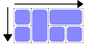
CSS Grid Layout(グリッドレイアウト)は、2次元レイアウト を、HTML/CSS を使って簡単・自由に操作できる、CSSの新しい機能です。
格子状のマス目のグリッドに好きな順番に配置したり結合したりすることで、様々なレイアウトが可能になります。
例えば、こんな簡単なHTMLで・・・
<body>
    <h1>タイトル</h1>
    <article>記事1</article>
    <article>記事2</article>
    <article>記事3</article>
    <article>記事4</article>
    <nav>ナビ</nav>
    <footer>フッター</footer>
</body>
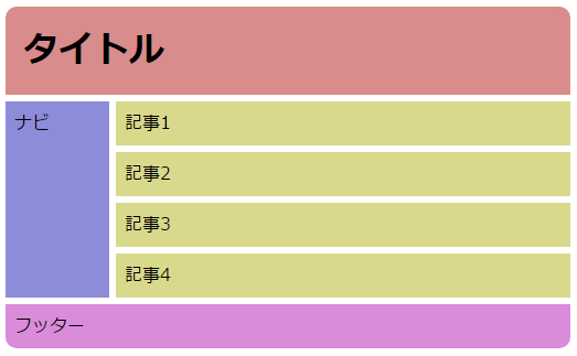 当記事では、こんなレイアウトを可能にする CSS Grid Layout の解説をしていきます。
尚、CSS Grid Layout は現時点︵2017年4月︶ではまだ新しいモジュールのため、対応ブラウザが少ないです。
︵Fx52~、GC57~、Safari10.1~、Opera44~ など︶
Can I use... CSS Grid Layout
しかし、2017年3月にはFirefox, Google Chrome, Opera, Safari などが CSS Grid Layout 対応のバージョンをリリースしており、今後に対応ブラウザが急増するのは確実なので、ぜひともマスターしておきたいです。
この記事は4部構成の中の 基礎編 です。
CSS Grid Layout を極める!︵基礎編︶ ←これ
CSS Grid Layout を極める!︵場面別編︶
作成中‥CSS Grid Layout を極める!︵アルゴリズム編︶
作成中‥CSS Grid Layout を極める!︵番外編︶
当記事では、こんなレイアウトを可能にする CSS Grid Layout の解説をしていきます。
尚、CSS Grid Layout は現時点︵2017年4月︶ではまだ新しいモジュールのため、対応ブラウザが少ないです。
︵Fx52~、GC57~、Safari10.1~、Opera44~ など︶
Can I use... CSS Grid Layout
しかし、2017年3月にはFirefox, Google Chrome, Opera, Safari などが CSS Grid Layout 対応のバージョンをリリースしており、今後に対応ブラウザが急増するのは確実なので、ぜひともマスターしておきたいです。
この記事は4部構成の中の 基礎編 です。
CSS Grid Layout を極める!︵基礎編︶ ←これ
CSS Grid Layout を極める!︵場面別編︶
作成中‥CSS Grid Layout を極める!︵アルゴリズム編︶
作成中‥CSS Grid Layout を極める!︵番外編︶
1. Grid Layout の用語
まずは、この後の解説を理解しやすくなるよう、CSS Grid Layout特有の用語を見てみましょう。HTML要素が作る構成物
●コンテナ グリッド全体を囲む要素です。display: grid; または display: inline-grid; を指定することで、その要素は Grid Layout の コンテナ になります。
●アイテム
コンテナの子要素です。コンテナの直接の子要素は基本的にすべてアイテムになります。
<div style="display:grid;"> <!-- コンテナ -->
    <div></div> <!-- アイテム-->
    <p></p> <!-- アイテム -->
    <section> <!-- アイテム -->
        <div></div> <!-- これはアイテムではない -->
    </section>
</div>
その他の構成物
- ライン
︻チートシート︼Grid Layout用語の図解

2. Grid Layout を使う!
グリッドレイアウトを使う手順はたった3ステップです。 今回は簡単なサンプルとして、下のような2x2のレイアウトを作ってみます。
<ステップ1> HTML と 必須のCSS を記述する
まずは HTML を記述します。といっても非常に簡単で、記述しなければならない要素は ● コンテナ︵=グリッド全体を表す要素︶ ● アイテム︵=グリッドのエリアに配置する要素︶ だけです。各々のアイテムは、コンテナの子要素として記述してください。 要するに、HTML は下の例のように書けばオッケーです。<div id="container"> <!-- コンテナ -->
<div id="itemA">A</div> <!-- アイテム -->
<div id="itemB">B</div> <!-- アイテム -->
<div id="itemC">C</div> <!-- アイテム -->
</div>
そして、コンテナ に display: grid; と記述します。
#container {
    display: grid; /* グリッドレイアウト */
}
これで必須のHTML/CSSの記述は終わりです。
<ステップ2> CSS で各トラックの大きさを指定する
次に、縦横それぞれのトラックの大きさを指定します。
ここで使う新しいプロパティは下の2つです。これらを コンテナ のスタイルとして記述します。
- grid-template-rows: 行のトラックの高さを半角スペースで区切って指定
- grid-template-columns: 列のトラックの幅を半角スペースで区切って指定
(※「s」を忘れやすいので注意!)
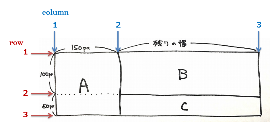
行のトラックの高さは、1行目は100px、2行目は50pxなので、下のようになります。
grid-template-rows: 100px 50px;
列のトラックの幅は、1列目は150px、2列目は残り全部です。
ここで新しい単位 fr というのを使います。今は「残りの幅」という指定だと理解しておいてください。
grid-template-columns: 150px 1fr;
これで、トラックの高さ・幅の指定はできました。
#container {
    display: grid;
    grid-template-rows: 100px 50px;
    grid-template-columns: 150px 1fr;
}
<ステップ3> CSS でアイテムの配置を指定する
<ステップ3 - 方法A> ラインの番号で指定する
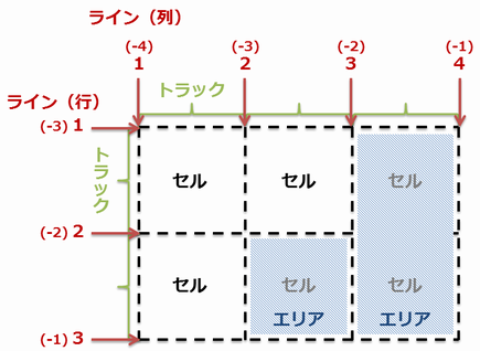
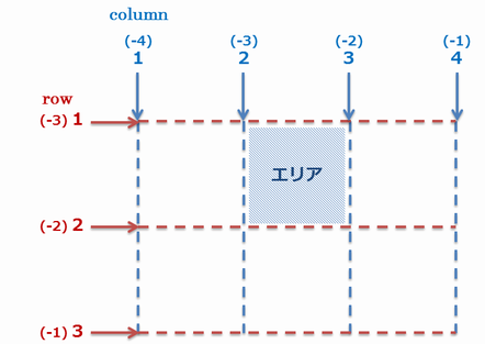
この方法で新しく使うプロパティは下の2つです。これらをそれぞれの アイテム のスタイルとして記述します。 ● grid-row: アイテムが占める行のラインの番号をスラッシュ区切りで指定する ● grid-column: アイテムが占める列のラインの番号をスラッシュ区切りで指定する 言葉だとちょっと分かりづらいですね。サンプルは一旦置いておいて、行2トラックx列3トラックのグリッドの例で見てみましょう。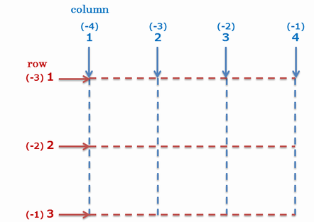 このように行2トラックx列3トラックの場合、rowのラインは1~3、columnのラインは1~4が存在することになります。
番号は1から始まること、ラインは両端にもあるので最大のラインの番号はトラックの数+1になることに注意です。
︵図では括弧書きになっていますが、負の数字でも指定することが出来ます。︶
アイテム をグリッドのどこに配置するのかは、このラインの番号を用いて指定することになります。
このように行2トラックx列3トラックの場合、rowのラインは1~3、columnのラインは1~4が存在することになります。
番号は1から始まること、ラインは両端にもあるので最大のラインの番号はトラックの数+1になることに注意です。
︵図では括弧書きになっていますが、負の数字でも指定することが出来ます。︶
アイテム をグリッドのどこに配置するのかは、このラインの番号を用いて指定することになります。
 row 1~2、column 2~3 を占めているので、下のようになります。
#item {
    grid-row: 1 / 2;
    grid-column: 2 / 3;
}
尚、このように隣り合わせのラインを指定する場合は、スラッシュのあとを省略することも出来ます。
#item {
    grid-row: 1;
    grid-column: 2;
}
 row 1~3、column 3~4 を占めているので、下のようになります。
#item {
    grid-row: 1 / 3;
    grid-column: 3 / 4;
}
/ span ○○ のように記述します。
#item {
    grid-row: 1 / span 2; /* ライン番号1から始めて、2つ先のラインまで伸ばす */
    grid-column: 3 / span 1; /* ライン番号3から始めて、1つ先のラインまで伸ばす */
}
/ span 1 が指定されているのと同じということです。
#item {
    grid-row: 1 / span 2;
    grid-column: 3;
}
また、図に書いてあるように負のラインの番号で指定することも出来ます。
#item {
    grid-row: -3 / -1; /* or -3 / span 2 */
    grid-column: -2 / -1; /* or -2 / span 1 */ /* or -2  */
}
grid-row: -2;あるいはgrid-column: -2;になるんですね。
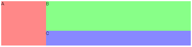
<div id="itemA">A</div> は row 1~3、column 1~2 を占めているので、下のようになります。
#itemA {
    grid-row: 1 / 3;
    grid-column: 1 / 2;
    background: #f88;
}
<div id="itemB">B</div> は row 1~2、column 2~3 を占めているので、下のようになります。
#itemB {
    grid-row: 1 / 2;
    grid-column: 2 / 3;
    background: #8f8;
}
同様に<div id="itemC">C</div> は row 2~3、column 2~3 を占めているので、下のようになります。
#itemC {
    grid-row: 2 / 3;
    grid-column: 2 / 3;
    background: #88f;
}
これで、方法AによるGrid Layoutが完成しました。
<div id="container">
    <div id="itemA">A</div>
    <div id="itemB">B</div>
    <div id="itemC">C</div>
</div>
/* コンテナ */
#container {
    display: grid;
    grid-template-rows: 100px 50px;
    grid-template-columns: 150px 1fr;
}

/* アイテム */
#itemA {
    grid-row: 1 / 3;
    grid-column: 1 / 2;
    background: #f88;
}
#itemB {
    grid-row: 1 / 2;
    grid-column: 2 / 3;
    background: #8f8;
}
#itemC {
    grid-row: 2 / 3;
    grid-column: 2 / 3;
    background: #88f;
}
 実際のサンプル ︵サンプルが動かない場合には、ブラウザが対応しているかどうか確認してみてください。Can I use... CSS Grid Layout︶
<ステップ3 - 方法B> エリアに名前を付けて指定する
この方法で新しく使うプロパティは下の2つです。 ● grid-template-areas: エリアを作ってそれぞれに名前を付ける︵コンテナのスタイルとして記述する︶ ● grid-area: 各アイテム が占めるエリアの名前を指定する︵アイテムのスタイルとして記述する︶ grid-template-areasの指定の仕方は独特です。まずはサンプルの場合の例を見てみましょう。 このサンプルは、2x2のグリッドとみなすことが出来ます。
 これを
これを grid-template-areas を使って書くと、このようになります。
#container {
    grid-template-areas:
        "areaA areaB"
        "areaA areaC";
}
"︶で囲まれた1行の文字列が、グリッドの1行を表しています。
1行の文字列に含まれる一連の文字︵areaA、areaB など︶はエリアの名前を表しています。エリアの名前は自由に決めることが出来ます。
エリアの名前は半角スペース(areaAは縦方向に2つセルを占めている。︶
このように指定することで、アスキーアートのように視覚的にエリアを記述することができるわけです。
また、見た目を整えるために、半角スペースを複数続けることや、文字列の前後に付けることも出来ます。
名前を付ける必要のないセルにはピリオド︵.︶を一つ以上連続して記述します。
︵エリアに名前がないというだけですので、grid-row/grid-columnを使えばその場所にもアイテムを配置できます。︶
#container {
    grid-template-areas:
        "header header header"
        "nav contents aside"
        ". footer .";
}

/* ↓分かりやすく見た目を整える↓ */

#container {
    grid-template-areas:
        " header header   header "
        " nav    contents aside  "
        " .....  footer   .....  ";
}
さてさきほども書きましたが、最初のサンプルの場合はこのように記述すればいいでしょう。
#container {
    grid-template-areas:
        "areaA areaB"
        "areaA areaC";
}
#itemA {
    grid-area: areaA;
}
これで、方法BによるGrid Layoutが完成しました。
<div id="container">
    <div id="itemA">A</div>
    <div id="itemB">B</div>
    <div id="itemC">C</div>
</div>
/* コンテナ */
#container {
    display: grid;
    grid-template-rows: 100px 50px;
    grid-template-columns: 150px 1fr;
    grid-template-areas:
        "areaA areaB"
        "areaA areaC";
}

/* アイテム */
#itemA {
    grid-area: areaA;
    background: #f88;
}
#itemB {
    grid-area: areaB;
    background: #8f8;
}
#itemC {
    grid-area: areaC;
    background: #88f;
}
実際のサンプル (サンプルが動かない場合には、ブラウザが対応しているかどうか確認してみてください。Can I use... CSS Grid Layout)
【チートシート】Grid Layoutで使用するプロパティ
方法A(ラインの番号で指定する)で使うもの
- コンテナに指定 grid-template-rows: 行のトラックの高さを半角スペースで区切って指定
- コンテナに指定 grid-template-columns: 列のトラックの幅を半角スペースで区切って指定
- アイテムに指定 grid-row: アイテムが占める行のラインの番号をスラッシュ区切りで指定する
- アイテムに指定 grid-column: アイテムが占める列のラインの番号をスラッシュ区切りで指定する
/* コンテナ */
#container {
    display: grid;
    grid-template-rows: 100px 50px;
    grid-template-columns: 150px 1fr;
}
/* アイテム */
#item {
    grid-row: 1 / 3;
    grid-column: 1 / 2;
}
方法B(エリアに名前を付けて指定する)で使うもの
- コンテナに指定 grid-template-rows: 行のトラックの高さを半角スペースで区切って指定
- コンテナに指定 grid-template-columns: 列のトラックの幅を半角スペースで区切って指定
- コンテナに指定 grid-template-areas: エリアを作ってそれぞれに名前を付ける
- アイテムに指定 grid-area: 各アイテム が占めるエリアの名前を指定する
/* コンテナ */
#container {
    display: grid;
    grid-template-rows: 100px 50px;
    grid-template-columns: 150px 1fr;
    grid-template-areas:
        "areaA areaB"
        "areaA areaC";
}
/* アイテム */
#item {
    grid-area: areaA;
}
3. サンプル
- 写真と文章を左右に振って配置する
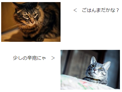
<dl id="images">
    <dt id="dt1"><img src="cat0.jpg" alt="猫0"></dt>
    <dd id="dd1"><p>< ごはんまだかな?</p></dd>
    <dt id="dt2"><img src="cat1.jpg" alt="猫1"></dt>
    <dd id="dd2"><p>少しの辛抱にゃ ></p></dd>
</dl>
#images {
    display: grid;
    grid-template-columns: 200px 200px
}
#dt1 {
    grid-row: 1; grid-column: 1;
    margin-bottom: 20px;
}
#dd1 {
    grid-row: 1; grid-column: 2;
}
#dt2 {
    grid-row: 2; grid-column: 2;
}
#dd2 {
    grid-row: 2; grid-column: 1;
}
- よくある2カラムレイアウト
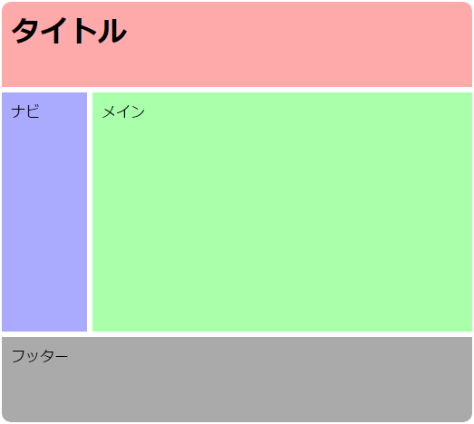
<h1>タイトル</h1>
<main>メイン</main>
<nav>ナビ</nav>
<footer>フッター</footer>
body {
    display: grid;
    margin: 0;
    min-height: 100vh;
    grid-template-rows: 100px 1fr 100px;
    grid-template-columns: 100px 1fr;
}
body > * {
    margin: 3px;
    padding: 10px;
}
h1 {
    grid-row: 1;
    grid-column: 1 / span 2;
    background: #faa;
    border-radius: 10px 10px 0 0;
}
main {
    grid-row: 2;
    grid-column: 2;
    background: #afa;
}
nav {
    grid-row: 2;
    grid-column: 1;
    background: #aaf;
}
footer {
    grid-row: 3;
    grid-column: 1 / span 2;
    background: #aaa;
    border-radius: 0 0 10px 10px;
}
- よくある3カラムレイアウト
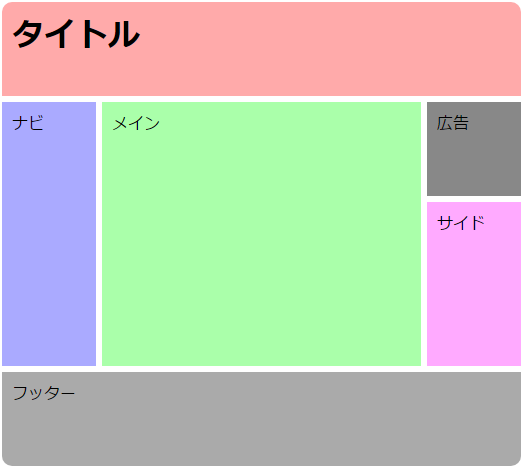
<h1>タイトル</h1>
<main>メイン</main>
<nav>ナビ</nav>
<aside id="side">サイド</aside>
<footer>フッター</footer>
<aside id="ad">広告</aside>
body {
    display: grid;
    margin: 0;
    min-height: 100vh;
    grid-template-rows: 100px 100px 1fr 100px;
    grid-template-columns: 100px 1fr 100px;
    grid-template-areas:
        "title  title  title "
        "nav    main   ad    "
        "nav    main   side  "
        "footer footer footer";
}
body > * {
    margin: 3px;
    padding: 10px;
}
h1 {
    grid-area: title;
    background: #faa;
    border-radius: 10px 10px 0 0;
}
main {
    grid-area: main;
    background: #afa;
}
nav {
    grid-area: nav;
    background: #aaf;
}
#side {
    grid-area: side;
    background: #faf;
}
footer {
    grid-area: footer;
    background: #aaa;
    border-radius: 0 0 10px 10px;
}
#ad {
    grid-area: ad;
    background: #888;
}
4. 今までと何が違う?
CSS Grid Layout と CSS Flexible Box Layout
CSS Flexible Box Layout とは、おなじみdisplay: flex; を使ったレイアウトです。
両者の違いは、要素の配置の次元にあります。
| CSS Grid Layout | CSS Flexible Box Layout | |
|---|---|---|
| CSSの記述 | display: grid; /* or inline-grid */ | display: flex; /* or inline-flex */ |
| 配置の次元 | 2次元 | 1次元 |
|
縦横自由に配置 |
 折り返しはするけど一方向 |
CSS Grid Layout と HTMLの<table>
HTMLの<table>も同様にグリッドレイアウトを実現できますが、用法が全く異なります。
決定的な違いは、HTMLのセマンティック(意味)です。
CSS Grid Layout では、HTMLを操作せずにグリッドレイアウトを実現します。
つまり、HTMLのセマンティックを変えずに表示を変えることができるのです。
<!-- CSS を用いてグリッドレイアウトにする -->
<h1>タイトル</h1>
<main>メイン</main>
<nav>ナビ</nav>
<footer>フッター</footer>
当然、これを<table>を使って記述するのはダメです。なぜなら、HTMLのセマンティックがおかしなことになってしまうからです。
<table>
    <tr><td colspan="2"><h1>タイトル</h1>
    <tr><td><nav>ナビ</nav><td><main>メイン</main>
    <tr><td colspan="2"><footer>フッター</footer>
</table>
しかし逆に、HTMLの<table>を使うべき場面もあります。表をデータとして表示する場合などです。
<table>
    <caption>果物の値段</caption>
    <thead>
        <tr><th>店名<th>りんご<th>もも
    </thead>
    <tbody>
        <tr><th>A店<td>100円<td>300円
        <tr><th>B店<td>110円<td>280円
    </tbody>
</table>