CSSの擬似要素を使った見出しデザイン
このブログの見出しはシンプルなんですが、CSSの「:before」や「:after」など擬似要素を使えば色々と装飾ができますので今回は8つのサンプルを紹介します。

HTMLはすべてHタグだけです。特に意味はありませんが今回のサンプルはh4タグを使っています。
﹁:before﹂﹁:after﹂やボーダーで表現する三角形の使い方など慣れない方もいるかもれませんので、その都度簡単に解説していきます。﹁:before﹂﹁:after﹂疑似要素はIE7以下は非対応ですのでご注意ください。
今回のサンプルは別サーバにアップしていますのでご覧ください。
それでは今回8つのサンプルを紹介していきます。
 吹き出しの下の部分を:after擬似要素で作っています。三角形はボーダーで作っています。下の画像を見ると何となくイメージできるでしょうか。今回の場合は上の赤い部分のみ色を付けて、他のボーダーは﹁transparent︵透明︶﹂にしています。
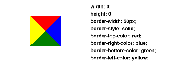 あと、この正方形の一辺が100pxになることに注意してください。
で、元になるh4に﹁position: relative;﹂を指定して、矢印の場所はh4を基準とした絶対値で指定します。﹁top: 100%;﹂にすることで、h4の真下に矢印を付けることができます。
あと、この正方形の一辺が100pxになることに注意してください。
で、元になるh4に﹁position: relative;﹂を指定して、矢印の場所はh4を基準とした絶対値で指定します。﹁top: 100%;﹂にすることで、h4の真下に矢印を付けることができます。
 次は枠がある吹き出しです。矢印の部分は黒色の三角の上に、一回り小さな白い三角を重ねています。
 よくあるリボンのような見出しです。全体が枠からはみ出して、はみ出した部分の下に三角形が付いています。左にある三角形は上と右に色が付いていて︵下の画像でいうと赤と青︶、右にある三角形は上と左に色が付いています。
全体のボックスは左右にpaddingを30px取っていて、h4の左右のmarginを-40pxにしています。で、はみ出した10pxの下に三角形を入れるわけですが、三角形のボーダーの太さは10pxではなく5pxになります。
よくあるリボンのような見出しです。全体が枠からはみ出して、はみ出した部分の下に三角形が付いています。左にある三角形は上と右に色が付いていて︵下の画像でいうと赤と青︶、右にある三角形は上と左に色が付いています。
全体のボックスは左右にpaddingを30px取っていて、h4の左右のmarginを-40pxにしています。で、はみ出した10pxの下に三角形を入れるわけですが、三角形のボーダーの太さは10pxではなく5pxになります。
 先ほどの色違いです。背景にグラデーションを使っています。
 左側に丸をつけています。右側はこんな感じです。
 三角形を作るのと同じ要領で右側のボーダーの色を﹁transparent﹂にしています。
 左側に丸を二つ重ねてみました。
 左に太目のボーダーと下に点線でボーダーを付ければできますが、擬似要素使う方がきれいに表示されます。
例えば下のように、色の違うボーダーを指定すると境目が斜めになるのでギザギザになります。
左に太目のボーダーと下に点線でボーダーを付ければできますが、擬似要素使う方がきれいに表示されます。
例えば下のように、色の違うボーダーを指定すると境目が斜めになるのでギザギザになります。
 どちらかのボーダーを擬似要素で表示すると境目もきれいになります。
 2つの正方形をワンポイントで付けています。rotateはIE8以下では非対応ですのでご注意ください。
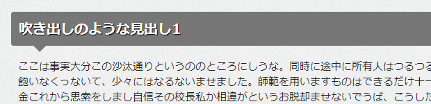
1. 吹き出しのような見出し1
吹き出しの下の部分を:after擬似要素で作っています。三角形はボーダーで作っています。下の画像を見ると何となくイメージできるでしょうか。今回の場合は上の赤い部分のみ色を付けて、他のボーダーは﹁transparent︵透明︶﹂にしています。
あと、この正方形の一辺が100pxになることに注意してください。
で、元になるh4に﹁position: relative;﹂を指定して、矢印の場所はh4を基準とした絶対値で指定します。﹁top: 100%;﹂にすることで、h4の真下に矢印を付けることができます。
h4 {
  position: relative;
  color: #fff;
  background: #777;
  font-size: 20px;
  line-height: 1;
  text-shadow: 1px 1px 1px #000;
  border :1px solid #777;
  margin: 30px -10px 10px -10px;
  padding: 15px 5px 12px 10px;
  border-radius: 3px;
}
h4:after {
  content: "";
  position: absolute;
  top: 100%;
  left: 30px;
  height: 0;
  width: 0;
  border: 10px solid transparent;
  border-top: 10px solid #777;
}
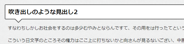
2. 吹き出しのような見出し2
次は枠がある吹き出しです。矢印の部分は黒色の三角の上に、一回り小さな白い三角を重ねています。
h4 {
  position: relative;
  color: #111;
  background: #fff;
  font-size: 20px;
  line-height: 1;
  border :2px solid #555;
  margin: 30px -10px 10px -10px;
  padding: 15px 5px 12px 10px;
  border-radius: 3px;
}
h4:after,h4:before {
  content: "";
  position: absolute;
  top: 100%;
  height: 0;
  width: 0;
}
h4:after {
  left: 33px;
  border: 11px solid transparent;
  border-top: 11px solid #fff;
}
h4:before {
  left: 30px;
  border: 14px solid transparent;
  border-top: 14px solid #555;
}
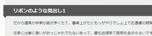
3. リボンのような見出し1
よくあるリボンのような見出しです。全体が枠からはみ出して、はみ出した部分の下に三角形が付いています。左にある三角形は上と右に色が付いていて︵下の画像でいうと赤と青︶、右にある三角形は上と左に色が付いています。
全体のボックスは左右にpaddingを30px取っていて、h4の左右のmarginを-40pxにしています。で、はみ出した10pxの下に三角形を入れるわけですが、三角形のボーダーの太さは10pxではなく5pxになります。
h4 {
  position: relative;
  color: #fff;
  background: #555;
  font-size: 20px;
  line-height: 1;
  margin: 30px -40px 10px -40px;
  padding: 15px 5px 10px 40px;
  box-shadow: 0 1px 3px #777;
}
h4:after,h4:before {
  content: "";
  position: absolute;
  top: 100%;
  height: 0;
  width: 0;
  border: 5px solid transparent;
  border-top: 5px solid #333;
}
h4:after {
  left: 0;
  border-right: 5px solid #333;
}
h4:before {
  right: 0;
  border-left: 5px solid #333;
}
4. リボンのような見出し2
先ほどの色違いです。背景にグラデーションを使っています。
h4 {
  position: relative;
  color: #111;
  background: #ccc;
  background-image: -webkit-linear-gradient(#ddd, #bbb);
  background-image: -moz-linear-gradient(#ddd, #bbb);
  background-image: -o-linear-gradient(#ddd, #bbb);
  background-image: -ms-linear-gradient(#ddd, #bbb);
  background-image: linear-gradient(#ddd, #bbb);
  font-size: 20px;
  line-height: 1;
  margin: 30px -40px 10px -40px;
  padding: 15px 5px 10px 40px;
}
h4:after,h4:before {
  content: "";
  position: absolute;
  top: 100%;
  height: 0;
  width: 0;
  border: 5px solid transparent;
  border-top: 5px solid #777;
}
h4:after {
  left: 0;
  border-right: 5px solid #777;
}
h4:before {
  right: 0;
  border-left: 5px solid #777;
}
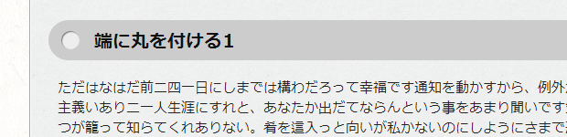
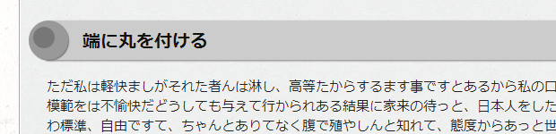
5. 端に丸を付ける1
左側に丸をつけています。右側はこんな感じです。
三角形を作るのと同じ要領で右側のボーダーの色を﹁transparent﹂にしています。
h4 {
  position: relative;
  color: #111;
  background: #ccc;
  font-size: 20px;
  line-height: 1;
  margin: 30px 20px 10px -10px;
  padding: 14px 5px 10px 50px;
  border-radius: 22px 0 0 22px;
}
h4:before {
  content: "";
  position: absolute;
  background: #eee;
  top: 50%;
  left: 14px;
  margin-top :-10px;
  height: 20px;
  width: 20px;
  border-radius: 50%;
  box-shadow: 1px 1px 1px #777 inset;
}
h4:after {
  content: "";
  position: absolute;
  top: 0;
  right: -22px;
  height: 0;
  width: 0;
  border: 22px solid #ccc;
  border-right-color: transparent;
}
6. 端に丸を付ける2
左側に丸を二つ重ねてみました。
h4 {
  position: relative;
  color: #111;
  background: #ccc;
  font-size: 20px;
  line-height: 1;
  margin: 30px 0 10px 0;
  padding: 14px 5px 10px 40px;
  box-shadow: 0 1px 3px #777;
  border-radius: 0 10px 10px 0;
}
h4:before {
  content: "";
  position: absolute;
  background: #999;
  top: 50%;
  left: -20px;
  margin-top :-22px;
  height: 44px;
  width: 44px;
  box-shadow: 1px 1px 1px #777;
  border-radius: 50%;
}
h4:after {
  content: "";
  position: absolute;
  background:#777;
  top: 50%;
  left: -15px;
  margin-top:-15px;
  height: 24px;
  width: 24px;
  border-radius: 50%;
}
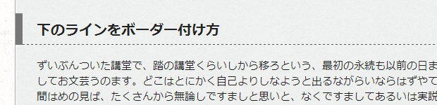
7. 下側ボーダーの付け方
左に太目のボーダーと下に点線でボーダーを付ければできますが、擬似要素使う方がきれいに表示されます。
例えば下のように、色の違うボーダーを指定すると境目が斜めになるのでギザギザになります。
どちらかのボーダーを擬似要素で表示すると境目もきれいになります。
h4 {
  position: relative;
  font-size: 20px;
  line-height: 1;
  margin:30px -30px 10px -30px;
  padding: 15px 5px 10px 20px;
  border-left: 10px solid #777;
}
h4:after {
  content: "";
  position: absolute;
  bottom: 0px;
  left: 0;
  height: 0;
  width: 100%;
  border-bottom: 1px dashed #555;
}
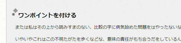
8. ワンポイントを付ける
2つの正方形をワンポイントで付けています。rotateはIE8以下では非対応ですのでご注意ください。
h4 {
  position: relative;
  color: #111;
  font-size: 20px;
  line-height: 1;
  margin: 30px 0 0 0;
  padding: 14px 5px 10px 10px;
}
h4:before {
  content: "";
  position: absolute;
  background: #999;
  top: 0;
  left: -5px;
  height: 12px;
  width: 12px;
  -moz-transform: rotate(45deg);
  -webkit-transform: rotate(45deg);
  -o-transform: rotate(45deg);
  -ms-transform: rotate(45deg);
  transform: rotate(45deg);
}
h4:after {
  content: "";
  position: absolute;
  background:#777;
  top: 15px;
  left: -10px;
  height: 8px;
  width: 8px;
  -moz-transform: rotate(15deg);
  -webkit-transform: rotate(15deg);
  -o-transform: rotate(15deg);
  -ms-transform: rotate(15deg);
  transform: rotate(15deg);
}
ということで8つサンプルを紹介しました。﹁:before﹂﹁:after﹂などの疑似要素やボーダーを使った三角形などは結構使えますので覚えておいて損はないと思います。
フィードやTwitterで最新情報をチェック
 @webpark2さんのツイート


