ゴーストボタンにマウスを乗せたときの動きいろいろ16個
昨年くらいから流行っているらしいゴーストボタンというもののサンプルをいくつか作ってみました。皆さん色々作られていて、今さら感もありますがぜひご覧ください。
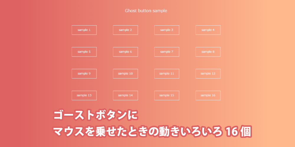
今回、以下のルールに沿って16個サンプルを作りました。
●HTMLは全て同じ
●マウスを乗せる前は同じ状態
●擬似要素は使っても1つだけ
擬似要素を2つ使ったり、spanなんかをはさんでやるともっと色々できると思いますが、今回はシンプルにマウスを乗せたときに動きをつけるサンプルを紹介します。
サンプルはこのページで全て載せていますが、まとめて見たいという方はこちらをどうぞ。
ということで、HTMLはこんな感じになります。
<a href="#" class="btn sample1">sample 1</a>普通のリンクですね。btnは共通部分、sample1はサンプルごとで違ってくる部分になります。 では、共通部分のCSSです。
a.btn{
  display: inline-block;
  width: 120px;
  margin: 45px 40px 40px;
  padding: 15px 10px;
  border: 1px solid #fff;
  background: transparent;
  color: #fff;
  text-align: center;
  text-decoration: none;
  line-height: 1;
  transition: .3s;
}
これはマウスを乗せていない状態で、マウスを乗せたときのスタイルはそれぞれのクラスで記述します。
1. 枠とテキストの色が変わる
シンプルに枠とテキストが変化します。rgbaカラーでなくてもいいと思います。
a.sample1:hover {
  border: 1px solid rgba(0,0,0,.5);
  color: rgba(0,0,0,.5);
}
2. 枠と背景の色が変わる
枠と背景が変わります。こちらもrgbaカラーでなくてもいいと思います。
a.sample2:hover {
  border: 1px solid rgba(0,0,0,.1);
  background: rgba(0,0,0,.5); }
3. 枠の内側がぼんやり白くなる
box-shadowを使って内側をぼんやり白くしています。
a.sample3:hover {
  box-shadow: 0 0 20px 5px rgba(255,255,255,.3) inset;
}
4. 背景を白くテキストを黒くする
白抜きのボタンにします。
a.sample4:hover {
  background: #fff;
  color: #555;
}
5. 枠が丸くなる
a.sample5:hover {
  border-radius: 8px;
}
6. 枠が太くなる
擬似要素を使って枠を太くします。擬似要素を使う関係でボタン本体にpositionとz-indexを指定します。
a.sample6 {
  position: relative;
  z-index: 2;
}
a.sample6::after {
  display: block;
  content: "";
  position: absolute;
  z-index: 1;
  top: 0;
  left: 0;
  width: 100%;
  height: 100%;
  border: 0 solid #fff;
  transition: .3s;
}
a.sample6:hover::after {
  border-width: 3px;
}
7. 円が広がるようにして背景が変わる
擬似要素を使った円が大きくなって全体を覆います。擬似要素の方が大きくなりますので、ボタン本体にoverflow: hidden;を指定します。
a.sample7 {
  position: relative;
  z-index: 2;
  overflow: hidden;
}
a.sample7::after {
  display: block;
  content: "";
  position: absolute;
  z-index: -1;
  top: 50%;
  left: 50%;
  width: 0;
  height: 0;
  margin: 0;
  border-radius: 50%;
  background: rgba(0,0,0,.2);
  transition: .3s;
}
a.sample7:hover::after {
  width: 130px;
  height: 130px;
  margin: -65px 0 0 -65px;
}
8. 四角形が大きくなり背景色が変わる
今度は四角が大きくなります。先ほどのようにネガティブマージンで擬似要素を真ん中に表示しても大丈夫です。逆に先ほどのものにこの指定方法は使えません。擬似要素が基準となる要素よりも大きいからです。
a.sample8 {
  position: relative;
  z-index: 2;
}
a.sample8::after {
  display: block;
  content: "";
  position: absolute;
  z-index: -1;
  top: 0;
  bottom: 0;
  left: 0;
  right: 0;
  width: 0;
  height: 0;
  margin: auto;
  background: rgba(0,0,0,.2);
  transition: .3s;
}
a.sample8:hover::after {
  width: 100%;
  height: 100%;
}
9. 右側から背景色が変わる
右側から背景色が変わります。
a.sample9 {
  position: relative;
  z-index: 2;
}
a.sample9::after {
  display: block;
  content: "";
  position: absolute;
  z-index: -1;
  top: 0;
  left: 0;
  width: 0;
  height: 100%;
  margin: 0;
  background: rgba(0,0,0,.2);
  transition: .3s;
}
a.sample9:hover::after {
  width: 100%;
}
10. 擬似要素がめくれて背景が変わる
a.sample10 {
  position:relative;
  z-index:2;
  perspective:400px;
  transition-delay:0;
  transition-delay:0
}

a.sample10::after {
  display:block;
  content:"";
  position:absolute;
  z-index:-1;
  top:0;
  left:0;
  width:100%;
  height:100%;
  margin:0;
  background:rgba(0,0,0,.2);
  transition:.3s;
  visibility:hidden;
  transform:rotateX(270deg);
  transform-origin:50% 0;
  transition:.3s
}
11. 円が広がるようにして背景が変わる2
サンプル7と似ていますが、こちらは白くなります。白くなるのでテキスト色も変える必要があります。
a.sample11 {
  position:relative;
  z-index:2;
  overflow:hidden
}
a.sample11::after {
  display:block;
  content:"";
  position:absolute;
  z-index:-1;
  top:50%;
  left:50%;
  width:0;
  height:0;
  margin:0;
  border-radius:50%;
  background:#fff;
  transition:.3s
}
a.sample11:hover {
  color:#555
}
a.sample11:hover::after {
  width:130px;
  height:130px;
  margin:-65px 0 0 -65px
}
12. 右側から背景色が変わる2
こちらはサンプル9と似ています。transition-delayを使って、背景が変わってからテキストが浮き出るようにしています。マウスを外したときはテキストが消えてから背景が変わります。transition-delayに馴染みがない方は、「マウスを乗せたときと外したときでtransitionの内容を変える方法|Webpark」を参考にしてください。
a.sample12 {
  position:relative;
  z-index:2;
  overflow:hidden;
  transition-delay:0;
}
a.sample12::after {
  display:block;
  content:"";
  position:absolute;
  z-index:-1;
  top:0;
  left:-100%;
  width:100%;
  height:100%;
  margin:0;
  background:#fff;
  transition:.3s;
  transition-delay:.4s
}
a.sample12:hover {
  color:#555;
  transition-delay:.4s
}
a.sample12:hover::after {
  left:0;
  transition-delay:0
}
13. 円が広がって消える1
円が広がって消えます。最初は縦横130pxに対して、ボーダーが各65pxということで、要素全てがボーダーでできています。ボーダーはrgba(255,255,255,0)ですので、見えていません。
マウスを乗せると、ボーダーが白く小さくなります。背景色指定していませんので、円が広がるようにして消えます。
a.sample13 {
  position:relative;
  z-index:2;
  overflow:hidden
}
a.sample13::after {
  display:block;
  content:"";
  position:absolute;
  z-index:-1;
  top:50%;
  left:50%;
  width:130px;
  height:130px;
  margin:-65px 0 0 -65px;
  border:65px solid rgba(255,255,255,0);
  border-radius:50%;
  transition:.5s
}
a.sample13:hover::after {
  border-width:0;
  border-color:rgba(255,255,255,1)
}
14. 円が広がって消える2
先ほどとほぼ同じですがボーダーがsolidからdottedになっています。すごいことをしているように見えますがボーダーの種類を変えただけです。
a.sample14 {
  position:relative;
  z-index:2;
  overflow:hidden
}
a.sample14::after {
  display:block;
  content:"";
  position:absolute;
  z-index:-1;
  top:50%;
  left:50%;
  width:130px;
  height:130px;
  margin:-65px 0 0 -65px;
  border:65px dotted rgba(255,255,255,0);
  border-radius:50%;
  transition:.5s
}
a.sample14:hover::after {
  border-width:0;
  border-color: rgba(255,255,255,1)
}
15. 円が広がって消える3
今度はdoubbleにしています。同じものが続くと芸がないので、マウスを外したときの変化をなくしています。
マウスを乗せたときのみにtransitionを指定することで、マウスを乗せたときだけ変化させています。
a.sample15 {
  position:relative;
  z-index:2;
  overflow:hidden
}
a.sample15::after {
  display:block;
  content:"";
  position:absolute;
  z-index:-1;
  top:50%;
  left:50%;
  width:130px;
  height:130px;
  margin:-65px 0 0 -65px;
  border:65px double rgba(255,255,255,0);
  border-radius:50%
}
a.sample15:hover::after {
  border-width:0;
  border-color:rgba(255,255,255,1);
  transition:.5s
}
16. 円が広がって背景色が変わる
先ほどと似ていますが、マウスを乗せたときの要素の背景色が白くなります。
a.sample16 {
  position:relative;
  z-index:2;
  overflow:hidden
}
a.sample16::after {
  display:block;
  content:"";
  position:absolute;
  z-index:-1;
  top:50%;
  left:50%;
  width:130px;
  height:130px;
  margin:-65px 0 0 -65px;
  border:65px double rgba(255,255,255,0);
  border-radius:50%;
  transition:.5s
}
a.sample16:hover {
  color:#555
}
a.sample16:hover::after {
  border-width:0;
  border-color:rgba(255,255,255,1);
  background:#fff
}
さいごに
ということでゴーストボタンにマウスを乗せたときの動きを色々と考えてみました。 ボーダーを使ったものなんかは個人的に気に入っています。難しいことをしていそうですが非常にシンプルです。 ちょっとしたことですが、マウスを乗せたときに変化を付けると全体の印象も変わってくると思います。 お役に立てばうれしいです。フィードやTwitterで最新情報をチェック
 @webpark2さんのツイート


かなり使えそうなボタンがたくさんありますね!
sample10についてはCSS部分、
/*-----------------------------------*/
a.sample10:hover::after {
visibility: visible;
transform: rotateX(0);
}
/*------------------------------------*/
を加える必要があるようです。